To tell the truth, I was initially dissatisfied with KFP3. This dissatisfaction contains deep worries, because in recent years, DreamWorks' works have always been excellent in visual effects, but the script, including How to Train Your Dragon 2 has such obvious faults that it detracts from the feeling of the whole film.
In recent years, DreamWorks' works have always lacked such a coherent sense of smoothness, and this is an important criterion for a script to give people a very intuitive "well-written".
Several films in a row are the same, and the unbuffered rhythm like fast-forwarding at eight times makes it a bit tiring to watch, and there is no chance to breathe.
For example, How to Train Your Dragon 2, I think it is an excellent work. I always think it is so, but it lacks detailed choices. It is like a canvas covered with bright colors. The viewer often loses the focus and does not know what it wants to express? I don't think How to Train Your Dragon 2 is bad in terms of characterization, but, seriously, it would be nice to express what the mainline wants to express in more detail.
Perhaps because it's a sequel and prologue that connects the previous and the next, I leave all my expectations for How to Train Your Dragon 3, hoping it will be a masterpiece that will amaze me at first glance.
*** *** ***
Speaking of KFP3, although I am not satisfied with its script, this film relies on excellent visual effects, skilled storyboards, bold use of colors and dreamlike art settings Conquer me at the first brush, these outstanding parts make me feel that even if the script is short, it doesn't matter at all, KFP3 is such a work.
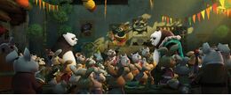
It shocked me at the beginning. The setting of the spirit world is really a very clever design for the purpose of creating a visual feast, for the anti-gravity performance that is out of reality. In the film, there are several comic-like storyboard interpretations, 3D pseudo-2D pictures, and bold use of those contrasting colors that make people feel very "vulgar" in Chinese folk paintings: bright yellow, emerald green, pink, but it has such an outstanding effect.
Many animations have bright and colorful colors, and KFP3's color use is deliberately "vulgar", using a bunch of extreme high-saturation contrasting colors, bright red, green, bright yellow, pink and pink all over the whole painting, the effect is bright, not vulgar. This unique beauty is the first time I've seen so many animations.
When I played for the first time, I just saw the opening of KFP3, and I secretly said, ah, completely surpassing How to Train Your Dragon 2, so shocking... It's wonderful. There is a slight loss, but soon I feel ridiculous, how can I not make progress! This constant improvement is exactly what I should be delighted with. In just 2 years, DreamWorks has made a leap forward in the pursuit of vision. How can this not be surprising?
How to Train Your Dragon 2 and KFP3 are not easy to compare. The styles are different. The How to Train Your Dragon series is the kind of extreme realism. A shot is swept over, and hundreds of soldiers in the background are doing their own things, without the slightest sloppy. KFP3 is Chinese-style freehand brushwork. The background is always like an ink painting.
If I want to talk about "China" indiscriminately, I admit that I have no such thing. Frankly speaking, I am not someone who knows much about traditional culture. I can only talk about my feelings casually. The main axis of the story of KFP3 is very simple.
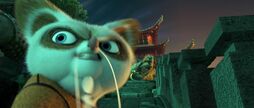
PO calls himself at the beginning of the story, and I am also full of doubts. I don't know who I am and how to preach and teach?
And at the end of the story, I finally understand, the development of the cliché at first sight. But in the face of the attack of a powerful enemy, he realized what he should do, and sacrificed his life to save everyone. When PO went to the spiritual world, was he "dead"?
Maybe? In short, when PO faced the juncture of life and death, he realized it, and only then did he exert his hidden strength and truly become a dragon hero. Although he was soon forced to come back, he was wearing a bamboo hat and silk robe, and his lines when he expressed his dragon-shaped infuriating energy really looked like a downright Chinese hero.
This paragraph is very Chinese, and the effect will be better in the Chinese version. The lines in the Chinese version are also well done this time. It is not just a simple translation, but "tells the whole story in Chinese", of course I thought that as a martial arts (Xianxia?) story, the wording in some lines was a little more vague, maybe more of a martial arts flavor.
When I was swiping three times, I suddenly got the cuteness of Hu Niu. What can I say, this image is very powerful and unique. DreamWorks female characters are generally "high in force" and "strong", but Hu Niu has a distinctive temperament, which is the so-called "chivalrous" temperament. I have seen a lot of such images in ancient Chinese works. , but not really in American animation. She is silent, restrained, and loves to talk with her hands behind her back, talk less, and do more, I love her pinch when PO vowed to defeat the gods and made a fuss against the wooden man.
Seeing the micro-knowledge, the force pulls a thousand points.
At that time, the chivalrous spirit overflowed the entire screen.
This is the unique charm of this image, a strong woman, but unlike valka or arstid, it is her own unique strength. Hu Niu has carried a lot of burdens, always focusing on the overall situation, watching her beloved master being turned into a jade pendant by the gods, sighing, and still fulfilling her mission with the overall situation first... Even if this mission is only a supporting role-style "biography" letter" task.
Similarly, the master, the turtle master, and the goose father are also very "Chinese" characters in various senses. I won't expand it here.
In my opinion, KFP3 is a sincere masterpiece with only regrets in the script, but the lack of the script makes me feel no worries. After reading it several times, I think the second half of it is very good, I love it (how many times have I written the word "love to death"...) The part where PO leads all the villagers in Panda Village to practice the exercises, That color, that storyboard, the Panda Village battle against Heavenly Demon was lively and fun, and when the mountains and rivers were exhausted, PO finally realized it, so the Dragon Hero came into the world, and the dialogue between PO and Master Turtle in the spiritual world, these plots were very well put together.
But I can't deny that every time I watch the first half, I always feel a little bored. The panda village doesn't seem to be that beautiful! ! ! Pandas are not very cute except for being simple and honest! ! ! Is that part of the father and son making a riot at the Emerald Palace really funny? Is it funny? ? ? It feels like it can be cut off at all...
While being moved by the sincerity and being shocked by the visual effects, I also really hope that DreamWorks can create a good script more carefully, not to blindly cater to the public's preferences, I hope it can See stories that are more structured and flow more smoothly and naturally.
Among the previous DreamWorks works, the best at this point, I think, are How to Train Your Dragon 1 and Shrek 2. These two impeccable masterpieces represent that DreamWorks is not without this strength. If home is a helpless move to make money in a low period, I also saw that DreamWorks abandoned or shelved several projects in 2014, and KFP3 is basically a success and a complete success, then I can look forward to the dream Is the factory truly revived?
Like this poetic name, DreamWorks, which is constantly chasing dreams, is exactly what moved me.
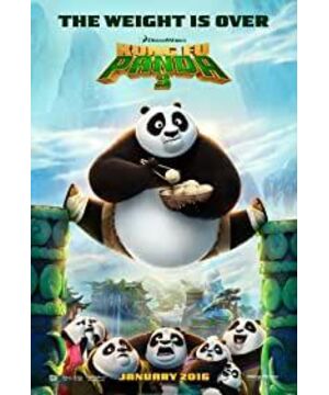
View more about Kung Fu Panda 3 reviews